Beyond Just Numbers: How Pictures Make Sense of Data in Your Apps
- Arjun S S
- Jun 16, 2025
- 3 min read
Ever looked at a giant spreadsheet full of numbers and felt your eyes glaze over? It's hard to spot trends or understand what's really going on when you're just looking at rows and columns. But what if those numbers were turned into a clear chart, a colorful graph, or an easy-to-read dashboard? Suddenly, everything clicks!
That's the power of data visualization in UI design. In simple words, data visualization is about turning complex numbers, facts, and information into easy-to-understand pictures, charts, and graphs within your app or website. It's about using visuals to tell a clear story that numbers alone can't.
Why Does Turning Numbers into Pictures Matter So Much?
Our brains are amazing at processing visual information. We can spot patterns, compare things, and understand relationships in a picture far faster than by reading through a list of figures. Here's why good data visualization is a game-changer:
Instant Understanding:
Imagine: Trying to see if sales are going up or down by looking at a list of daily numbers for a year.
With Data Viz: A simple line graph instantly shows you the trend. Your brain "gets it" in a second.
Spotting Patterns and Trends:
Imagine: Trying to compare performance across 20 different teams from a table.
With Data Viz: A bar chart makes it easy to see which teams are doing best and worst at a glance.
Making Decisions Faster: When information is clear and easy to grasp, you can make informed decisions much more quickly.
Engaging and Interesting: Visuals are naturally more engaging than plain text or tables. They make even dry data come alive.
Telling a Story: Good data visualization tells a story about the data – it guides your eye to the most important insights.
Reducing Errors: When information is clearly presented, there's less chance of misinterpreting the numbers.
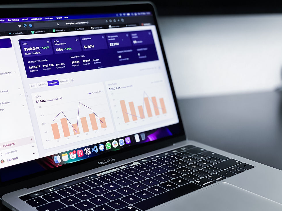
Common Ways Apps Turn Data into Pictures (and What They're Good For):
Bar Charts (For Comparing Things):
What it is: Rectangular bars that show quantities.
Good for: Comparing different categories (e.g., sales by product type, website visitors from different countries).
Line Graphs (For Showing Changes Over Time):
What it is: Points connected by lines showing how something changes.
Good for: Tracking trends (e.g., stock prices over months, daily active users).
Pie Charts (For Showing Parts of a Whole):
What it is: A circle divided into slices, where each slice represents a percentage of the total.
Good for: Showing how different parts contribute to a whole (e.g., market share, budget allocation). (Use carefully, too many slices can be confusing!)
Dashboards:
What it is: A collection of different charts and key numbers on one screen, giving a quick overview.
Good for: Business leaders, personal finance tracking, fitness apps showing all your stats.
Designing Data Viz That Actually Helps (Not Confuses!):
It's easy to make a pretty chart that's actually useless. Good UI for data visualization focuses on:
Simplicity First: Don't overload the chart with too much information. Focus on the key message. Remove unnecessary clutter.
Clear Labels: Make sure all axes, bars, and slices are clearly labeled so users know exactly what they're looking at.
Meaningful Colors: Use colors consistently and purposefully. For example, use different shades of one color to show more/less, or red/green for bad/good. Avoid using too many clashing colors.
Context is King: Provide a title, units (e.g., $, %), and a brief explanation so users understand what the data means.
Interactivity (Sometimes): Allow users to click on parts of the chart to see more details, filter data, or change the time period.
Consistency: Use the same types of charts and color schemes for similar data across your app.
The Takeaway: From Jumble to Jaw-Dropping Insights
Data visualization in UI design is about transforming daunting numbers into compelling visual stories. It empowers users to quickly grasp complex information, spot trends, and make smarter decisions, all without needing to be data scientists. By thoughtfully crafting how data is presented, designers ensure that the most important insights pop out, making your app not just functional, but truly intelligent and understandable.


Comments